Fraud Alert

Responsive Web Design for
Phone, Tablet and Desktop

Layouts that work on the phones, tablets and desktops that already convert, then tested before go-live. We design one site that adapts to every screen, so navigation, forms and the path to a lead or sale hold up wherever your visitors arrive.


150+ clients 450+ projects 275+ engineers 15+ years
Responsive web design for phone, tablet and desktop, Vervali
ISO/IEC 17025:2017 testing laboratory accreditation mark

ISO/IEC 17025:2017Accredited testing laboratory

CMMI Maturity Level 3 process award

CMMI Maturity Level 3The process is written down and repeats

ISO 9001:2015 quality management certification mark

ISO 9001:2015Quality management

ISO/IEC 27001 information security certification mark

ISO/IEC 27001Information security

Phone, Tablet and Desktop Layouts

One site that adapts to every screen, instead of a desktop design that simply shrinks.

Breakpoints and Layouts

The grid, type and spacing that hold together as the screen changes, planned around the devices your analytics already show.

Navigation and Forms

Menus, forms and calls to action that are easy to tap and finish on a phone. Native apps run through mobile app development.

Tested Before Go-Live

Every layout checked on real phones, tablets and browsers before launch. Deeper coverage runs through web app testing.

Most buyers judge your business on a phone before they ever see your desktop site.

Book a Call

What Breaks on Smaller Screens

The same few problems cost leads on almost every site that was designed desktop first.

Cramped Navigation

Menus that overflow, hide key pages or need two thumbs to open.

Hard-to-Finish Forms

Tiny fields, the wrong keyboard and errors that wipe what a visitor typed.

Slow, Heavy Pages

Desktop images and scripts that make phone visitors leave before the page loads.

Hidden Content

Tables, pricing and key details that break or disappear below tablet width.

What You Get

Designs your developers can build directly, with the decisions already made for every screen.

Mobile-First Wireframes

Page structure planned for the smallest screen first, then expanded for tablet and desktop.

Design System

Reusable components, type scales and spacing rules that stay consistent across every breakpoint.

Accessibility Built In

Contrast, focus states and tap targets designed to WCAG 2.2 AA. Formal audits run through accessibility testing.

Developer Handoff

Annotated screens for your team or ours. Builds run through website development.

Case Studies

Sites where a better experience on every screen showed up in sales within months.

CAD-products retailer · Online store

The store was losing carts on a path that already had traffic. After the first quarter, online sales were up and cart abandonment was down.

30% more online sales50% less cart abandonment

Specialty retailer · WooCommerce

Manual processing was eating the operation and the store was not converting the traffic it had. After three months, sales grew and manual work fell.

60% more online sales70% less manual processing

How a Design Project Runs

From a free review to approved layouts, 9am to 1pm Eastern with delivery from India.

  • 01

    Free Site Review

    We check your current site on real devices and show where visitors drop.

  • 02

    Breakpoint Plan

    We agree the devices, widths and page templates from your analytics.

  • 03

    Layout Design

    Mobile-first wireframes, then visual designs for every breakpoint.

  • 04

    Test and Hand Over

    Layouts checked on real devices, then handed to your build team or ours.

Start with a free site review

Make Every Screen Work for Your Business

Tell us the pages and the devices your visitors use. We come back with the layout scope and a fixed quote.

ISO/IEC 17025:2017 · CMMI Level 3 · 275+ engineers · 9am to 1pm Eastern

Frequently Asked Questions

Responsive web design is an approach where one website adapts its layout to the screen it is viewed on, whether that is a phone, tablet or desktop. Instead of running a separate mobile site, the grid, images, navigation and forms rearrange at set breakpoints. Done well, every visitor gets a page that is easy to read, quick to load and simple to act on.

Yes. Our website development team can build the site on your CMS or a custom stack, with testing included, so nothing is lost between approved layouts and live pages. If you already have developers, we hand over annotated designs and components they can build directly. The quote names who builds what before work starts, so there are no gaps or double charges.

Yes. Every layout is checked on real phones and tablets, plus the desktop browsers your analytics show, before it goes live. A resized desktop browser misses touch behaviour, keyboards, notches and real network speeds, so we do not rely on it alone. For deeper functional coverage or formal accessibility audits, our web app testing and accessibility testing teams run the full checks.

No. A responsive website runs in the browser and adapts to any screen, so visitors reach it from search or a link without installing anything. A mobile app is built for iOS or Android, installed from an app store, and can use device features such as notifications and offline mode. Many businesses need a responsive site first, and our mobile app team handles native apps.

Yes. Many projects start with a desktop-first site that never worked well on a phone. We review your current pages on real devices, keep the content and CMS where they work, and redesign the templates so they adapt at every breakpoint. Before quoting, we name which templates change and what the build involves, so you know the full scope up front.

Responsive design decides how a layout adapts across phone, tablet and desktop. UI is how the pages look, including type, colour, buttons and imagery. UX is whether a visitor can find what they need and finish a task without friction. A good project handles all three together, because a polished page that breaks on a phone still loses the visitor.

Responsive design applies to stores too, but catalogue, cart and checkout have their own conversion problems, so we cover them through our ecommerce design service. That work includes product pages, checkout flows and payment states on every screen size. If your project includes both a marketing site and a store, one quote can cover both, with the same team designing them.

Most engagements run at $25 to $49 an hour. A one-off responsive redesign is quoted as a fixed price based on the number of page templates, the breakpoints and the devices covered in testing. Ongoing page design can run on a monthly retainer. The written estimate names every cost before kickoff, and a free site review comes first so the scope matches your site.
dots-group-section

OUR BLOGS

Stay Ahead with Expert Insights,
Tech Trends, and Industry Innovations

QA Testing Services for SaaS Startups: How Vervali Works

How Vervali tests a SaaS startup's product: what to test first, when to outsource, manual or automation, the monthly cost at published rates, and how the free pilot…

By Nilesh Jain 6 min read
Read more

Test Automation as a Service: How Vervali Runs and Prices It

Vervali offers test automation as a service: framework, suite, CI integration and maintenance on a monthly allocation, from India with a 9am to 1pm Eastern overlap.

By Vincent Fernandes 6 min read
Read more

Shopify and Ecommerce Testing Cost: What Vervali Charges

Vervali publishes what Shopify and ecommerce testing costs: hourly rates by role, monthly billing for a dedicated tester or retainer, a fixed price for a pre-peak lo…

By Jagdish Gaikwad 7 min read
Read more

Use Case in Software Testing: How to Turn One Into Test Cases

Every path through a use case becomes at least one test case. A worked bank-transfer example shows the test table, and ISTQB's 2023 and 2025 syllabus changes explain…

By Sonal Jain 16 min read
Read more

What Is a Soak Test? How to Run One and Read the Results

What a soak test is, how it differs from load, stress and spike tests, how long to run it, the metrics that decide a pass, and how JMeter, k6 and Gatling hold a load…

By Jagdish Gaikwad 17 min read
Read more

Software Testing Checklist: What Belongs on It, Phase by Phase

This software testing checklist groups every item by the phase of the test process it belongs to, marks the items teams routinely skip, and shows how to wire the lis…
By Jagdish Gaikwad 19 min read
Read more

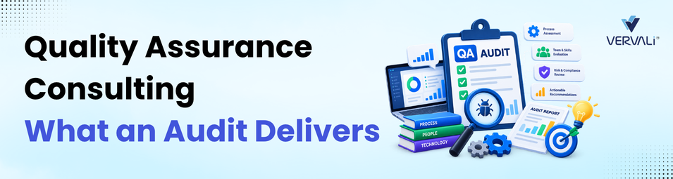
Quality Assurance Consulting: What a QA Maturity Assessment Actually Produces

This guide explains what a QA maturity assessment scores you against, what the deliverable looks like on the last day, and when advisory work is the wrong purchase.

By Jagdish Gaikwad 19 min read
Read more

Mobile App Testing Services in 2026: Devices, Store Rules and Cost

This guide explains what mobile app testing services cover, how to size a device matrix from United States traffic data, and what Apple and Google check before a rel…

By Jagdish Gaikwad 18 min read
Read more
new-blogs-right

Need Expert QA or
Development Help?

Our Expertise

contact
  • AI & DevOps Solutions
  • Custom Web & Mobile App Development
  • Manual & Automation Testing
  • Performance & Security Testing
contact-leading

Trusted by 150+ Leading Brands

contact-strong

A Strong Team of 275+ QA and Dev Professionals

contact-work

Worked across 450+ Successful Projects

new-contact-call-icon Call Us
721 922 5262

Collaborate with Vervali

EoR
Quality Assurance
Development
Cloud
Devops
Market Research